Page 1 of 1
Please help with (placing) shadows correctly on drawings
PostPosted: Thu Feb 09, 2006 12:02 am
by Warrior 4 Jesus
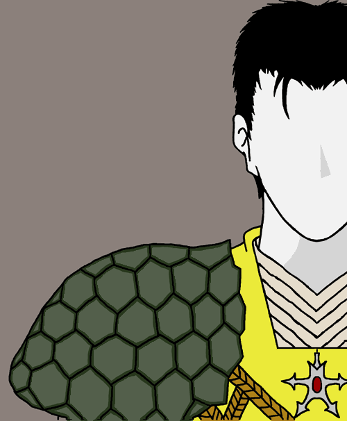
Many of you may have seen an earlier version of this. It's for my book cover and doesn't show much more but it is an improvement. I'm going to do a little more detail. I also want some help with knowing where to place the shadows when the light is coming from the top overhead left. I know how to place shadows with simple objects like spheres, cubes etc, but not something more complex like this.
Can anyone help? And does anyone have some good tips so I can work it out on my own in the future? (Also for the face I only want to imply it with shadow to keep it a little mysterious).
To give a few shadow hints: The gold armour he's wearing is made of some sort of metal, his tunic is cotton or something like that, and his shoulder armour is a turtle shell.
Thanks for your help!

PostPosted: Thu Feb 09, 2006 12:45 pm
by Esoteric
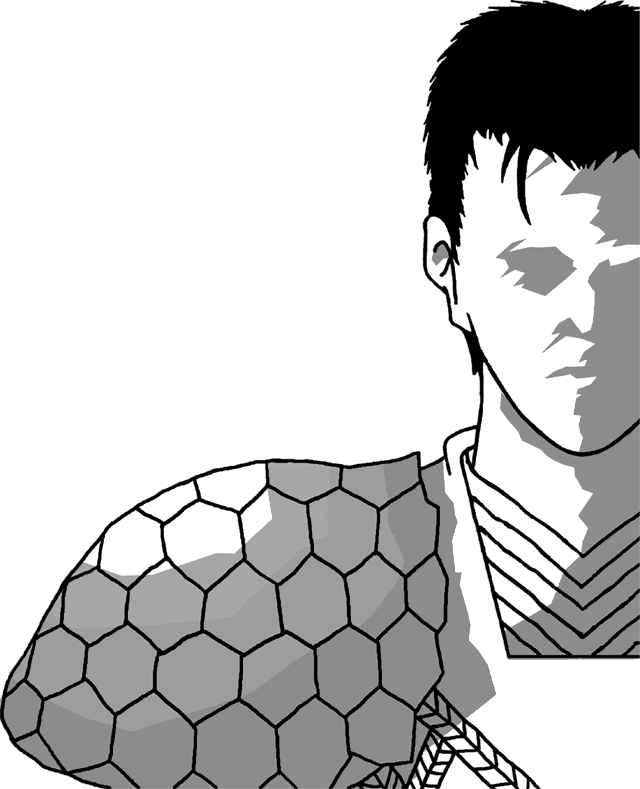
Hmm, well, that's tricky. The exact placement of the shadows depends on a person's face, although most faces have the same basic geometry. Have you tried looking at pictures of strongly lighted faces? That's the best way to learn...to study the shapes of the face. If you can't find what you're looking for, you can always use a flashlight and dark room to study light directions on your own face.
I'll admit I'm not very good with lighting faces either, but I'll take a stab at it... this is roughly where the shadows would be for a rear/side light source, the actual countour and shape of, the eye shadow, for example, would be dependant on the particular face. Maybe someone better at this can help too, like Torokun. He's new but a way better artist.
PostPosted: Thu Feb 09, 2006 5:36 pm
by Warrior 4 Jesus
Wow, Esoteric! You're good.
By flashlight do you mean 'torch'. A hand held device that emits light in dark places?
I do need to try that. And just practise a little.
Thanks for your help!
PostPosted: Fri Feb 10, 2006 7:18 am
by Esoteric
Warrior 4 Jesus wrote:Wow, Esoteric! You're good.
By flashlight do you mean 'torch'. A hand held device that emits light in dark places?
I do need to try that. And just practise a little.
Thanks for your help!
Oh, sorry, I forgot to speak 'English' English... (ehehe)
Yes, flashlight=torch.
PostPosted: Fri Feb 10, 2006 7:41 am
by Raiden no Kishi
I'm no skilled artist, and I'm gosh-awful at shading, but a note is that you would probably shade each hexagonal section of the turtle-shell pauldrons, as they usually are each domed. It would help it look more three-dimensional. Just a thought.
.rai//
PostPosted: Fri Feb 10, 2006 5:44 pm
by Warrior 4 Jesus
Thanks Raiden! Good tip.
PostPosted: Sun Mar 05, 2006 5:41 pm
by b0redx3
i know this post is a month too late, but i just want to post up what i thought.
i don't know how to explain the shadow to the face... but if you really want to be good at it, you should do more life studies. =]
sorry that the face is too small compare to the head. i'm not used to "filling in"... hahaha
PostPosted: Sun Mar 05, 2006 7:13 pm
by Warrior 4 Jesus
Thankyou so much bOred!
I've done life studies before and it did help drawing the human body but I haven't done much shadow studies at all.
I'll give this a spin. Thanks mate!
PostPosted: Sat Apr 01, 2006 5:20 am
by Warrior 4 Jesus
The results are mixed. Some bits look fine, others don't.

What have I done wrong?
Thanks
PostPosted: Sat Apr 01, 2006 10:54 pm
by Warrior 4 Jesus
? That more like it? I think the other version is more expressive in the fave though.
http://img.photobucket.com/albums/v281/CJesky/cover_1.gif
PostPosted: Mon Apr 03, 2006 10:24 pm
by Scarecrow
I like the lighting on the turtle shell better in the second picture but I personally liked the jagged face shadows from the first one. Of course, it really depends on the style you were going for but I dunno, I liked that jagged look

Can't say im very experienced but I know what looks cool

PostPosted: Sun Apr 09, 2006 8:45 pm
by Esoteric
Still working on this huh? Okay, I took another stab at it, but it really depends on where exactly you want the light source. A back light opposed to a side light generates very different shadows. It also depends on exactly how much detail you want your shading to have. If you want a very vague posterization, you can get away with quite a lot of inaccuracy. But if you want more realism, you have to consider highlights and core shadows. Greater shadow depth offers more details, but it will bring you closer to simply drawing the whole face.
Note: jagged shading lines on a face are definitely more dramatic, but will give the impression of wrinkles, either due to age, or an angry (clenched) expression.
PostPosted: Mon Apr 10, 2006 3:37 am
by Warrior 4 Jesus
Hi Esoteric, thanks for that. I'm a bit slow. I haven't been working on it much at all, more sketching ideas for my novel. Thanks again!
PostPosted: Mon Apr 10, 2006 7:44 am
by Phantom_Sorano
Your first thumbnote (lil'l picture) is by far the best one...quite realistic. Just play around with the shading on your eyes....and some shading showing age signs on their forehead and cheek-area would be nice. ^^
